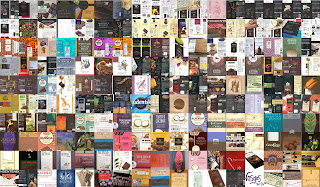

Left: A composite image of 170 chocolate wrappers collected over 17 years.
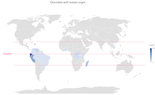
Right: A map shows the countries our chocolate comes from. They all lie within the chocolate belt along the equator.
In this post we analyze our chocolate consumption habits using data we've collected in our Scrapbook project. We've covered Scrapbook
in detail in previous posts (2017
introduction, 2019
our memex, 2021
ten user scenarios,
2022
natural language query parser). In our 2021
ten user scenarios post, we explain Scrapbook like this:
Scrapbook is a software platform for managing personal information. Information is anything that's important to you. For us that includes books, dinners with friends, correspondence, travel summaries, people, and music to name just a few categories. The goal of the Scrapbook platform is to capture, store, and easily recall this information securely, whenever, and wherever.
Nearing 12,000 entries, it becomes increasingly interesting to ask ourselves questions about what insights might in the data that we hadn't anticipated.
We have a lot of entries about chocolate for example. Whenever we bring home a new bar, we make a new entry. We capture the label, our impressions, brand, type, percentage, producer, rating, and origin. Can we understand a little more about something so many of us take for granted? Where does it come from? Who is making it? What are the qualities of one versus another? What drives our preferences?
We also have a little fun at our own expense in exposing our vices and consumption habits. We did something
similar in the post Orecchiette
Pasta Dishes and Recipes for our Favorites: Radish Pesto and Tomato-Broccoli.
How did we approach this analysis?
- We searched in Scrapbook under category "chocolate" and exported the results to JSON (or CSV).
- We found 170 chocolate entries covering just under 17 years between February 2005 to October 2021.
- The JSON data is imported into Excel for analysis and charting. Briefly, in Excel do the following:
- Load data: Data Menu / Get Data / From File / From JSON
- Use PowerQueryEditor
- Create table and expand any columns required.
- For more information, see the PowerQuery JSON docs.
- Of the 170 entries, we threw out three which had incomplete data.
- It's important to note that we don't make an entry for every bar of chocolate we buy or consume.
- Each entry is a different type or brand of chocolate that we've tried and chosen to document. So that's 170 distinct kinds of chocolate from a lot of different makers.
- Some chocolates we've enjoyed only once and others, dozens of times.
- We tend to select chocolate containing between 60% and 80% cocoa content by mass.
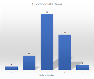
- We rate 4% of chocolate at 5/5, really exceeds expectation. (Example: Venchi: Cuor di Cacao)
- We rate 31% of chocolate at 4/5, exceeds expectation.
- We rate 50% of chocolate at 3/5, meets expectation.
- We rate 3% of chocolate t a1/5, really sucked. (Example: Orion Studentska Milk Chocolate with raisins and nuts.)
- Chocolate below 60% cacao for us doesn't typically score as high. We also don't buy it very often, which means our data is skewed toward higher cocoa percentage chocolate.
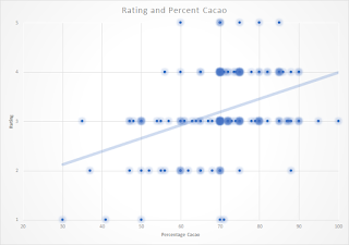
- A scatter plot of percentage on x-axis and rating on y-axis doesn't reveal as much as we thought it might. The correlation coefficient between rating and percentage is 0.38, which is considered a low correlation. This might mean that percentage isn't the driving factor in our rating, or it is an indication that our sample selection is biased.


Left: A histogram of chocolate rating (1 bad, 5 good).
Center: A histogram of chocolate percentage.
Right: A scatterplot of percentage versus rating.
No comments:
Post a Comment
All comments are moderated. If your comment doesn't appear right away, it was likely accepted. Check back in a day if you asked a question.