Friday, February 23, 2018

Mapping and Comparing the Murder Rates of Italy and the USA Using R

Overview | Code | Output

Map of the world depicting countries in green which have a homicide rate less than Italy.Map of Europe depicting countries in green which have a homicide rate less than Italy.Map of the word depicting countries in green which have a homicide rate less than the USA.
Three plots visually showing countries with a smaller and greater homicide rate than Italy and USA. Left: Map of the world depicting countries in green which have a homicide rate less than Italy. Center: Map of Europe depicting countries in green which have a homicide rate less than Italy. Right: Map of the word depicting countries in green which have a homicide rate less than the USA.

Overview


Traveling between the USA and Italy, you might be interested in crime statistics between the two countries as we were. In particular, we wanted to see if we could understand which country we were "safer". Safe is complex, multi-faceted concept, depending on where you are and what kind of things you do. To look at one facet of it, here we look at the murder rate per million people per country. These stats are published on the NationMaster site and are intentional homicides, number and rate per number and rate per million people.

The NationMaster site has a map where countries are colored light to dark based on their crime statistic. We wanted to look at the data in a slightly different way, specifically breaking the data into two: countries with a crime statistic greater than a reference country and countries with a crime statistic lower. Therefore, in a glance we could see for Italy or the USA (as the reference country) all the countries with the higher and lower values.

Code


You should be able to paste the code below directly onto the command line of your R environment. Here is the code on Github. See the notes below for more information.

require("dplyr")
require("rworldmap")
data(countryExData)

# www.nationmaster.com/country-info/stats/Crime/Violent-crime/Murder-rate-per-million-people
data.murder <- read.csv("Murder rate per million people.csv")
colnames(data.murder)[2] <- "Rate"

# get values for Italy and USA
rate.Italy <- data.murder[data.murder$Country=="Italy","Rate"]
rate.USA <- data.murder[data.murder$Country=="United States", "Rate"]

data.murder.Italy <- data.murder
data.murder.USA <- data.murder
data.murder.Italy$RateF <- mutate(data.murder, RateF=ifelse(Rate/rate.Italy >= 1, ifelse(Rate/rate.Italy == 1.0, 1.0, 2.0),0.0))$RateF
data.murder.USA$RateF <- mutate(data.murder, RateF=ifelse(Rate/rate.USA >= 1, ifelse(Rate/rate.USA == 1.0, 1.0, 2.0),0.0))$RateF

# Plotting variables
title <- "Country homicide crimes relative to"
pal <- c("lightgreen", "lightskyblue", "mistyrose2")

# World map referenced to Italy
data.joined.Italy <- joinCountryData2Map(data.murder.Italy, joinCode="NAME", nameJoinColumn="Country")
par(mai=c(0,0,0,0),xaxs="i",yaxs="i")
mapCountryData(data.joined.Italy, nameColumnToPlot="RateF")
mapParams <- mapCountryData(data.joined.Italy, nameColumnToPlot="RateF", addLegend=FALSE, catMethod="fixedWidth", numCats=3, colourPalette=pal, mapTitle="") 
do.call( addMapLegend, c(mapParams, legendWidth=0.5, legendMar = 2, legendLabels = "none" ))
text(x=0,y=120,labels=paste(title,"Italy"), cex=1.5)
text(c(-100,0,100),-140, labels=c("Rates less than Italy","Italy","Rates greater than Italy"))

# Europe map referenced to Italy
data.joined.Italy2 <- joinCountryData2Map(data.murder.Italy, joinCode="NAME", nameJoinColumn="Country")
par(mai=c(0,0,0,0),xaxs="i",yaxs="i")
mapCountryData(data.joined.Italy2, nameColumnToPlot="RateF")
mapParams <- mapCountryData(data.joined.Italy2, nameColumnToPlot="RateF", addLegend=FALSE, catMethod="fixedWidth", numCats=3, colourPalette=pal, mapTitle="", mapRegion="europe") 
do.call( addMapLegend, c(mapParams, legendWidth=0.5, legendMar = 2, legendLabels = "none" ))
text(x=17,y=75,labels=paste(title,"Italy"), cex=1.5)
text(c(2,17,32),30, labels=c("Rates less than Italy","Italy","Rates greater than Italy"))

# World map referenced to USA
data.joined.USA <- joinCountryData2Map(data.murder.USA, joinCode="NAME", nameJoinColumn="Country")
par(mai=c(0,0,0,0),xaxs="i",yaxs="i")
mapCountryData(data.joined.USA, nameColumnToPlot="RateF" )
mapParams <- mapCountryData(data.joined.USA, nameColumnToPlot="RateF", addLegend=FALSE, catMethod="fixedWidth", numCats=3, colourPalette=pal, mapTitle="" ) 
do.call( addMapLegend, c(mapParams, legendWidth=0.5, legendMar = 2, legendLabels = "none" ))
text(x=0,y=120,labels=paste(title,"USA"), cex=1.5)
text(c(-100,0,100),-140, labels=c("Rates less than USA","USA","Rates greater than USA"))


Notes:

  • On the NationMaster site, we selected all years to export. This gives the largest possible list of countries for comparison with the caveat that not all countries are compared for the same year. For this exercise of R code this wasn't a big concern. 
  • If you export the NationMaster stats into a CSV file into a specific directory, then make sure you use setwd() to change to that directory or modify the read.csv() statement in the code to point to the correct location. 
  • Using the rworldmap package is described here in the post Maps in R: Introduction - Drawing the map of Europe. See rworldmap package page on cran.r-project.org to get to the latest reference manual. 
  • The rworldmap::mapcountryData() method will warn about quantiles as discussed in this Stack Overflow post. If you look at the help (?mapcountryData) it says "will generate unhelpful errors in data categorisation if inappropriate options are chosen, e.g. with catMethod:Quantiles if numCats too high so that unique breaks cannot be defined."

Output


The code generates three plots. Two plots are referenced for Italy and one for the USA. Each plot has three colors, green, blue and orange. Green represents countries with less homicides than the reference country and orange represents countries with more homicides than the reference. Blue represents the reference country, either Italy or the USA.


  • Map 1: The world map referenced for Italy shows that there are many countries colored as orange, i.e., having more homicides. In the NationMaster data, there are only 19 countries with less homicide. Many are European and Scandinavian countries. A few countries with less homicide are in the Saudi Arabian Peninsula and others in Asia. The world map doesn't make it easy to see the smaller countries that are green.
  • Map 2: Zooming into Europe makes it easier to see the countries in Europe that have less homicide than Italy, including Denmark, Spain, Germany, Slovenia, Switzerland, Austrian, Norway, and Iceland.
  • Map 3: Back to the world map referenced on the USA, i.e., countries with less homicide than the USA are colored green and countries with more homicide are colored orange.


In 2010, 8.75 people per million were killed due to intentional homicide in Italy. For 2010, the number was 42.01 people per million in the USA. The UNODOC report Global Study on Homicide 2013 reports that for Italy, there were 0.9 homicides per 100,000 people with a total count for that year of 530. For the USA, the report gives 4.7 homicides per 100,000 people with a total count for that year of 14,827.

There will be discrepancy in the numbers because we are mixing years and different reporting sources, but it's still useful to do a sanity check.


  • In 2012, Italy's total population was about 60 million. 8.75 people per million x 60 million = 525 people, close to the UNODOC report.
  • In 2012, USA's total population was about 314 million. 42.01 people per million x 316 million = 13,275, about 10% off from UNDOC number.


The takeaway is that one is more likely to be killed by intentional homicide in the USA than in Italy. Crime in the United States Wikipedia article is a good introduction. It states that "Overall the total crime rate of the United States is higher than developed countries, specifically Europe, with South American countries and Russia being the exceptions", which is pretty much what is shown above.

An interesting side note from the UNDOC report is that "[i]n Italy, there has been a 50 per cent decline in this type of homicide since 2007, with organized crime-related rates of homicide decreasing from 0.2 to less than 0.1 per 100,000 population."

Update


2023-08-10:  This NYT article Why Is America Such a Deadly Place? references this report On gun violence, the United States is an outlier where there is this quote:  

Age-adjusted firearm homicide rates in the US are 13 times greater than they are in France, and 22 times greater than in the European Union as a whole. The US has 23 times the rate of firearm homicide seen in Australia. 
Our estimates above for Italy were about 5 times greater for Italy for the years mentioned above. Just an estimate.


Thursday, February 22, 2018

Using R to View the 2016 Italian Referendum Results

Overview | Code | Output


Three maps showing the elections of the 2016 Italian Referendum results. Left: Choropleth map. Center:  Bubble plot. Right: Worldwide bubble plot.

Overview


We are currently working our way through the edX.org Microsoft Professional Program in Data Science. There has been a lot of opportunity to work with the R programming language and software environment commonly used in statistical computing. In particular, the course Programming with R for Data Science gives students the opportunity to experiment with combining static maps (e.g. Google Maps) and data overlay overlays. In honor of the upcoming election in Italy, we thought it would be interesting to look at some recent Italian election statistics using R. The code plots the 2016 Italian Referendum results for inside Italy by region and worldwide. The data for this post comes from the Wikipedia article Italian constitutional referendum, 2016. Any errors transcribing the data are our own.

Code


You should be able to paste the code below directly onto the command line of your R environment. Here is the code on Github. See the notes below for more information.

require("ggplot2")
require("ggmap")
require("OpenStreetMap")
library(devtools)
install_github("quantide/mapIT")
require("mapIT")

regionsEN=c("Abruzzo", "Aosta Valley", "Apulia", "Basilicata", "Calabria",
"Campania", "Emilia-Romagna", "Friuli-Venezia Giulia", "Lazio",
"Liguria", "Lombardy", "Marche", "Molise", "Piedmont", "Sardinia",
"Sicily", "Trentino-South Tyrol", "Tuscany", "Umbria", "Veneto",
"Italy", "Europe", "'South America'", "'North America'", "Asia")

regionsIT=c("Abruzzo","Valle d\'Aosta", "Puglia", "Basilicata","Calabria",
"Campania", "Emilia-Romagna", "Friuli-Venezia Giulia", "Lazio",
"Liguria", "Lombardia", "Marche", "Molise", "Piemonte", "Sardegna",
"Sicilia", "Trentino-Alto Adige", "Toscana", "Umbria","Veneto",
"Italia", "Europa", "America meridionale", "American settentrionale e centrale",
"Africa, Asia, Oceania, Antartide")

isRegion=c(rep(TRUE,20),rep(FALSE,5))

electorate=c(1052049, 99735, 3280745, 467000, 1553741,
4566905, 3326910, 952493, 4402145,
1241618, 7480375, 1189180, 256600, 3396378, 1375845,
4031871, 792503, 2854162, 675610, 3725399,
46720943, 2166037, 1291065, 374987, 220252)

percentNo=c(64.4, 56.8, 67.2, 65.9, 67.0,
68.5, 49.6, 61.0, 63.3,
60.1, 55.5, 55.0, 60.8, 56.5, 72.2,
71.6, 46.1, 47.5, 51.2, 61.9,
60.0, 37.6, 28.1, 37.8, 40.3)

referendum=c(rep("No",6),"Yes",rep("No",9),"Yes", "Yes", rep("No", 3), rep("Yes", 4))
my.data <- data.frame(regionsEN, regionsIT, electorate, referendum, isRegion, percentNo)
my.data$regionsEN <- as.character(my.data$regionsEN)
latlon <- geocode(my.data$regionsEN)
my.data<-cbind(my.data,latlon)
my.data.Italy<-subset(my.data,isRegion==TRUE)
my.data.World<-subset(my.data,isRegion==FALSE)
title <- "Referendum 2016 Results"
circle_scale<-0.000004

# generate Italy map
p <- ggmap(get_map(location="Italy",zoom=6), extent="panel")
p <- p + geom_point(aes(x=lon, y=lat),data=my.data.Italy, 
colour=ifelse(my.data.Italy$referendum == "No",'red','green'),
alpha=0.4, size=my.data.Italy$electorate*circle_scale)
p <- p + labs(title=paste(title, "by Region"))
p

# general Italy choropleth map
gp <- list(guide.label="Percent\nNo\nVote", title="2016 Referendum Results by Region", 
low="green", high="red")
mapIT(percentNo, regionsIT, my.data.Italy,  graphPar=gp)

# generate world map
q <- openproj(openmap(c(70,-145), c(-70,145), zoom=1)) 
q <- autoplot(q) + geom_point(aes(x=lon, y=lat),data=my.data.World, 
col=ifelse(my.data.World$referendum == "No",'red','green'),
alpha=0.4, size=log(my.data.World$electorate))
q <- q + labs(x="lon", y="lat", title=paste(title,"Worldwide")) 
q


Notes

  • For an  R environment, we use both Microsoft R Client and RStudio, but prefer the latter slightly.
  • We made some minor tweaks to the region and constituencies (outside of Italy) to make geocoding easier and place the bubble for a given constituency in a position on the map that makes sense. In particular, we simplified 'North and Central America' to 'North America' and 'Africa, Asia, Oceania, Antarctica' to 'Asia'. 
  • The get_map()function can't produce world map as described in this Stack Overflow post, so we found other ways to create a world map with the rworldmap and openstreetmap package. We use the openstreetmap to create a world view and rworldmap along with mapIT to to create a choropleth map of Italy. 
  • The mapIT package is discussed in Building a choropleth map of Italy using mapIT. Note in the code above that there are two listings of the Italian regions and constituencies, regionsEN in English and regionsIT in Italian. regionsEN was used with ggmap::geocode() and regionsIT was used with mapIT
  • You may see over-query-limit warnings as described in the Stack Overflow post. We saw this in happen in the course of running the code multiple times.

Output


The code generates three plots as show at the head of this post.

The referendum was soundly defeated. Inside Italy, 60% voted against it. Only three regions approved it: Emilia-Romagna, Trentino-Alto Adige and Tuscany. The bubble plot shows the size of of the electorate (size of bubble) and their final vote (red for no and green for yes). The choropleth plot shows more clearly that the strongest no vote was more prevalent in the south of Italy.

About 10% of Italians are live outside of Italy and are broken into for constituencies: Europe, South America, North and Central America, and Africa / Asia / Oceania / Antarctica. Each of these constituencies voted for the referendum as can be seen in the worldwide bubble plot. In the worldwide plot, the logarithm of the number of votes is plotted. It's not a particularly compelling visualization because the size of the green bubbles (all constituencies outside of Italy) and the red bubble (Italy) could lead a viewer to incorrectly conclude the referendum passed overall.

For more on voting in Italy, in particular how overseas voting works, see The Italian March 2018 Election for Overseas Italians – Observations and Vocabulary Lesson.

Monday, February 19, 2018

The Italian March 2018 Election for Overseas Italians – Observations and Vocabulary Lesson


Overview


Italy is holding a general election on March 4, 2018. How and why this has come to be is better left to those more able to explain the situation than I: see, for example, Italian general election, 2018, Italy dissolves parliament for March election, and Paolo Gentiloni to succeed Matteo Renzi as Italian prime minister to see why the government was dissolved. Up for grabs in this election are 315 seats in the Italian Senate (Senato) and 630 seats in the Chamber of Deputies (Camera dei deputati), which is pretty much everything. So much for easing in change.

Fun with the 2018 Italian political party symbols (insignia). Represented here are about 40 symbols.Fun with the 2018 Italian political party symbols (insignia). Represented here are about 40 symbols.
Fun with the 2018 Italian political party symbols (insignia). Represented here are about 40 symbols.


Observations


Origins of the election aside, there are several confusing aspects we'd like to mention as seen by folks "outside" the system.

The first confusing aspect is the sheer number of parties in this election.

I lost track after counting over 30 parties registered. Wired.it reports 98 parties. Even though not all parties may be on the ballot (la scheda elettorale) for a given citizen in a given location, the choices are nonetheless overwhelming. At least, I think so. And, boy do Italians, err, I mean political parties love their symbols. It took me a couple of hours to line up all the round colorful symbols (insignia) and understand who and what ideas were behind each one. More on symbols is discussed below.

The second confusing aspect of this election is the process for voting.

This election is the first test of a new electoral law passed in 2017 called Rosatellum bis. In this law, 36% of the seats of both the Senate and Chamber of Deputies are allocated to candidates who receive the most votes, or winner takes all (collegi uninominali). The remaining 64% of the seats in both bodies are awarded proportionally to parties (collegi plurinominali) based on the votes received by each party. On the ballot, winner takes all and proportional system are combined in such a way that there are a couple of ways you can vote. As explained in the Wikipedia article on this election, you can:

I. Select a candidate representing a constituency AND select a party that supports him (there may be multiple because the candidate may be in coalition with different parties). Therefore, you make two X marks on your ballot. 
II. Select just a party. In this case, your vote extends to a candidate in coalition with the party. 
III. Select just a candidate representing a constituency. In this case, your vote is proportionally extended to those parties supporting the candidate.

Diagrams of how this looks on ballots is shown here in Today.it; though written in Italian, the link's images get the point across about the different choices and their implications. Some commentators are warning that voting as described in I. above is the only way to ensure your vote goes to who you intended.

Our ballots (shown below) are simpler than you'd find in Italy because they do not contain coalitions (coalizioni), and as far as we can tell, we just write our candidate's names next to the party they are associated with as well as draw an X on the party. You can find the list of candidates for overseas voters online at the Dipartimento per gli Affari Interni e Territoriali - Elezioni trasparenti site, under Circoscrizioni Estero. For Italians in North and Central American, the We the Italians site gives a nice overview of the choices of candidates and parties.

Finally, the third confusing aspect, yet also interesting, is the existence of parties and platforms focused on concerns specific to Italians living outside the country.

We are not used to thinking about the voting block outside of a country. Let's back up for a second and review the Italian voting system. Italians residing overseas (all'estero) are part of a "territory" (circoscrizione estero) that is in turn broken into four subdivisions (quattro ripartizioni): Europe, including the Asian territories of the Russian Federation and Turkey; South America; North and Central America; and Africa, Asia, Australia and Antarctic. Each subdivision has different parties and candidates on the ballot.  Of the seats in this general election, 6 of 315 seats of the Senate and 12 of the 630 Chamber seats will be elected by Italians abroad.

In the North and Central America ripartizione, we have – at time of writing this - two parties  which from their names are obviously focused on the concerns of Italians living abroad: Associative Movement Italians Abroad (MAIE) and the Free Flights to Italy (see Update below). Two of the items on MAIE's platform are, for example:


  • Eliminating the IMU (Imposta Municipale Unica). From the MAIE site: " Italians living abroad, today pay the IMU tax on their home in Italy, due to the fact that it is not considered 'first home', an unjust discrimination that must be revoked."
  • Extending healthcare to residents abroad. Again from the MAIE site: "Provide medical care to Italian residents abroad when they return temporarily to Italy. Italian citizens must have free access to the health care system in the country even if their residence is abroad."
The Free Flights to Italy (see Update below) platform seems to be all about culture with the "... specific target for the benefit of Italian citizens living abroad: building bridges between communities through free flights to and from Italy." Sign me up for those.

However, we also took a close look at all the candidates running under the Salvini-Berluconi-Meloni coalition - voting suggestions for mom not for us, I swear - and it was interesting to note that many of the candidates' platforms also made mention of IMU and healthcare as did MAIE. Many of the candidates representing voting blocks outside of Italy are tuned into their constituents. What a concept.

Perhaps the focus on overseas voters is less surprising when we look at the numbers. Using figures from the Italian Referendum of 2016 Numbers we can say that

- In Italy there were 46,720,943 voters. 
- Outside of Italy there were 4,052,341 voters. (This source gives a 4.3 million count of abroad voters.) 
- Together, these numbers indicate that about 9% of Italian voters live outside of Italy.

By comparison, there are about 9 million US citizens living abroad. With an estimated total USA population in 2016 of 321 million, we can estimate that about 3% of US citizens live outside the USA. Given the higher percentage of Italians abroad, it's fair to say that they represent an important voting block and, therefore, it makes some sense that there are specialized parties tailored to their concerns. But, really, free flights? Apparently no, see Update below.

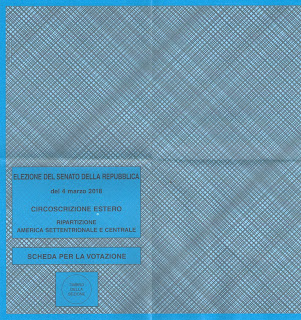
Ballots for the Chamber of Deputies (red) and the Senate (blue) for Italians living in the USA.Ballots for the Chamber of Deputies (red) and the Senate (blue) for Italians living in the USA.Ballots for the Chamber of Deputies (red) and the Senate (blue) for Italians living in the USA.Ballots for the Chamber of Deputies (red) and the Senate (blue) for Italians living in the USA.
Ballots for the Chamber of Deputies (red) and the Senate (blue) for Italians living in the USA.


Vocabulary and Grammar


Rather than tell you who to vote for, or who we voted for, we'll take this opportunity to highlight some of the new vocabulary and grammar we've encountered.

Plico


A plico is a group of papers or documents in a sealed envelope: a packet. In two years studying the Italian language, this was the first time I ever encountered this word. In our plico, there is a sheet with instructions that include this:

All'interno del plico troverete
  • 1 certificato elettorale
  • 1 o 2 liste dei candidati
  • 1 o 2 schede elettorali
  • 2 buste, una piccola di norma di colore bianco e una più grande già affrancata con l'indirizzo del competente ufficio Consolare
  • Il foglio informative.

This translates as: "Inside the packet you will find 1 election certificate, 1 or 2 lists of candidates, 1 or 2 election ballots, 2 envelopes, one small standard one (a security envelope) and one larger one postage-paid envelope addressed to the consulate of jurisdiction, and an instruction sheet." 

Our plico contained 2 lists of candidates and 2 associated ballots, one for the Senate and one for the Chamber of Deputies. I'm not sure under what conditions a voter would receive just one list of candidates or one ballot.

The certificate (certificato elettorale) is a sheet of paper from which you tear off the bottom part and send back with your ballot as proof that your vote is valid.

Instructions for the March 2018 election.A mailer received from a candidate running with the coalition Salvini-Berlusconi-Meloni (sounds like a repackaged version of spumone).
Left: Instructions for the March 2018 election. Right: A mailer received from a candidate running with the coalition Salvini-Berlusconi-Meloni (sounds like a repackaged version of spumone).

Contrassegni


Contrassegni are symbols that represent each party. There are rules for the creation of an symbol, such as that the symbol can't make reference to fascist or Nazi or religious themes, and it must be a circle. I immediately started wondering if they were always circles. It's seems like a practical standardization. I looked around a bit for the history of political symbols but couldn't find much by way of standardization or  their history, though I did stumble on to the site I simboli della discordia ("the symbols of discord"), which thoroughly describes this election's political symbols (in Italian).

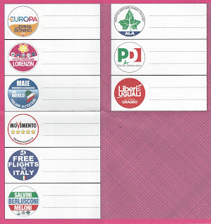
Some symbols contain other symbols (pulce) of parties in a sort of coalition. Examples of the ballots we received which have these are Civica Poplare or Salvini-Berlusconi-Meloni. 

The parties that Italians living in the USA can vote for in the Chamber of Deputies.The parties that Italians living in the USA can vote for in the Senate.
The parties that Italians living in the USA can vote for in the Chamber of Deputies and Senate.

Slogans


Below are some of the slogans we could find for the parties we had on our ballot. We couldn't find a well-defined slogan for MAIE, Partito Repubblicano, or Free Flights. Though Free Flights (see Update below) does make liberal use of "Time to Say Goodbye" (Con Te Partirò) by Sarah Brightman and Andrea Bocelli, which could sort of be counted as a slogan?

  • Avanti, Insieme – "Forward, together" [Partito Democratico, PD] 
  • Per i molti, non per i pochi – "For the many, not the few" [Liberi e Uguali, LeU]
  • Onestà, Esperienza, Saggezza – "Honesty, Experience, Wisdom" [Forza Italia, FI]*
  • Più Europa, serve all'Italia – "More Europe, Italy needs it" [Più Europa, +E]
  • Il vaccino control gli incompetenti – "The vaccine against incompetents" [Civica Popolare, CP]

* This slogan requires a comment.  Experience okay, wisdom maybe, but honesty after everything that has come out about Berlusconi?

Campaign Mailers


We received five campaign mailings. One from a MAIE candidate and four from Salvini-Berlusconi-Meloni (S-B-M) candidates. For educational purposes, let's look at one from the S-B-M camp, from Senate candidate Francesca Alderisi.  She writes:

Adesso sta a te fare la TUA scelta. Scegli con la testa. Scegli con il cuore! – "Now it's up to you to choose. Choose with your head. Choose with your heart!"

Update 3/3/2018

Alas, it turns out that the Free Flights to Italy party, a choice for North and Central American voters, is a hoax. As of today, their web site has been taken down and there is no trace of those free flights. Here are two Italian articles detailing what's known: Free Flights to Italy, il mistero del partito fake ammesso alle elezioni and Questo partito è una truffa? The erstwhile party was the idea of one Giuseppe Macario. His running mate? His mom.  I guess - and if you read to this point you knew it was coming - Con Lui Partirà.